With over 3.5 million unique visitors per month to their websites and presence in 13 African countries, Jumia had a considerable number of customers, high volume of orders and revenue.
Conversion Growth Through Data-Driven Design Optimization
But as the Jumia eCommerce platform continued to grow rapidly and expand its product range, customers encountered an increasingly degraded shopping experience with regards to navigation and product discovery.


Problem Statement
Despite a robust product selection and competitive pricing, users weren’t taking the final leap to purchase. Conversion rates were stagnant, with the sheer volume of products making it challenging for users to find what they wanted to shop for. This poor product discoverability had a direct impact on user satisfaction and overall platform usability.
The Solution Scope
To address this problem, the goal was clear: create user-friendly and engaging pages designs that would make navigation seamless for customers and provide them with an efficient and enjoyable shopping experience. The focus was not only on simplifying navigation but also on enabling better product discoverability, all while laying the groundwork for advanced personalization features.
A multifaceted approach was adopted to inform the redesign of the pages using the different data sources on page performance, included the data analytics, feedback from customers, competitive landscape bench-marking, and collaborative brainstorming sessions. Insights from these sources collectively shaped the foundations of the redesign strategy.
Hypotheses were developed based on this, and a series of rigorous A/B tests were performed across distinct user segments, providing empirical data to guide the direction of the new page designs.
KPIs Tracked
Click Through Rate
Percentage of customers who click on a link or button compared to the total number of users who see it. This gave an indication of the effectiveness design messaging in getting users to take the desired action.
Conversion Rate
Proportion of users who made a purchase from the featured category/ section compared to all those who visited the site. Knowing this helped us understand the performance of our designs and where improvements were needed.
Revenue per Impression
How much revenue is generated on average for each time a user interacts with design content they’ve interacted with. This helped us assess the effectiveness and profitability of design and marketing strategies.
Transactions per Impression
A measure of the number of completed transactions compared to the total number of times design element or content is shown to users. Knowing this gave insights into how efficient our design strategy was in turning design impressions into revenue driven actions.
A/B TEST IDEA
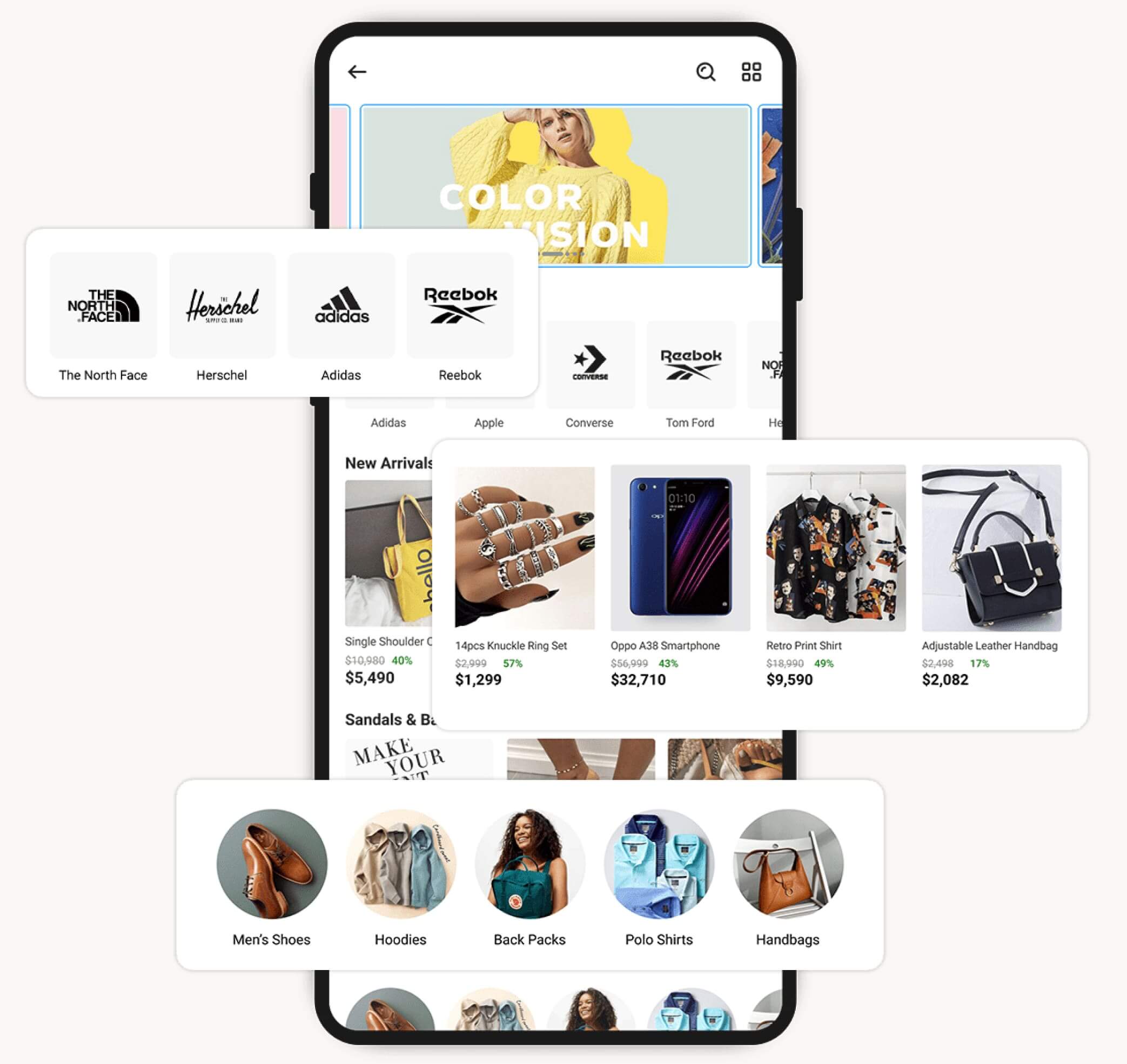
Brand Thumbnail Design
Not all customers are familiar with brand logos, causing hesitation in clicking on unfamiliar ones when displayed on the pages. This overlooked detail ultimately led to poor performance on brand store showcases because of the decreased engagement.
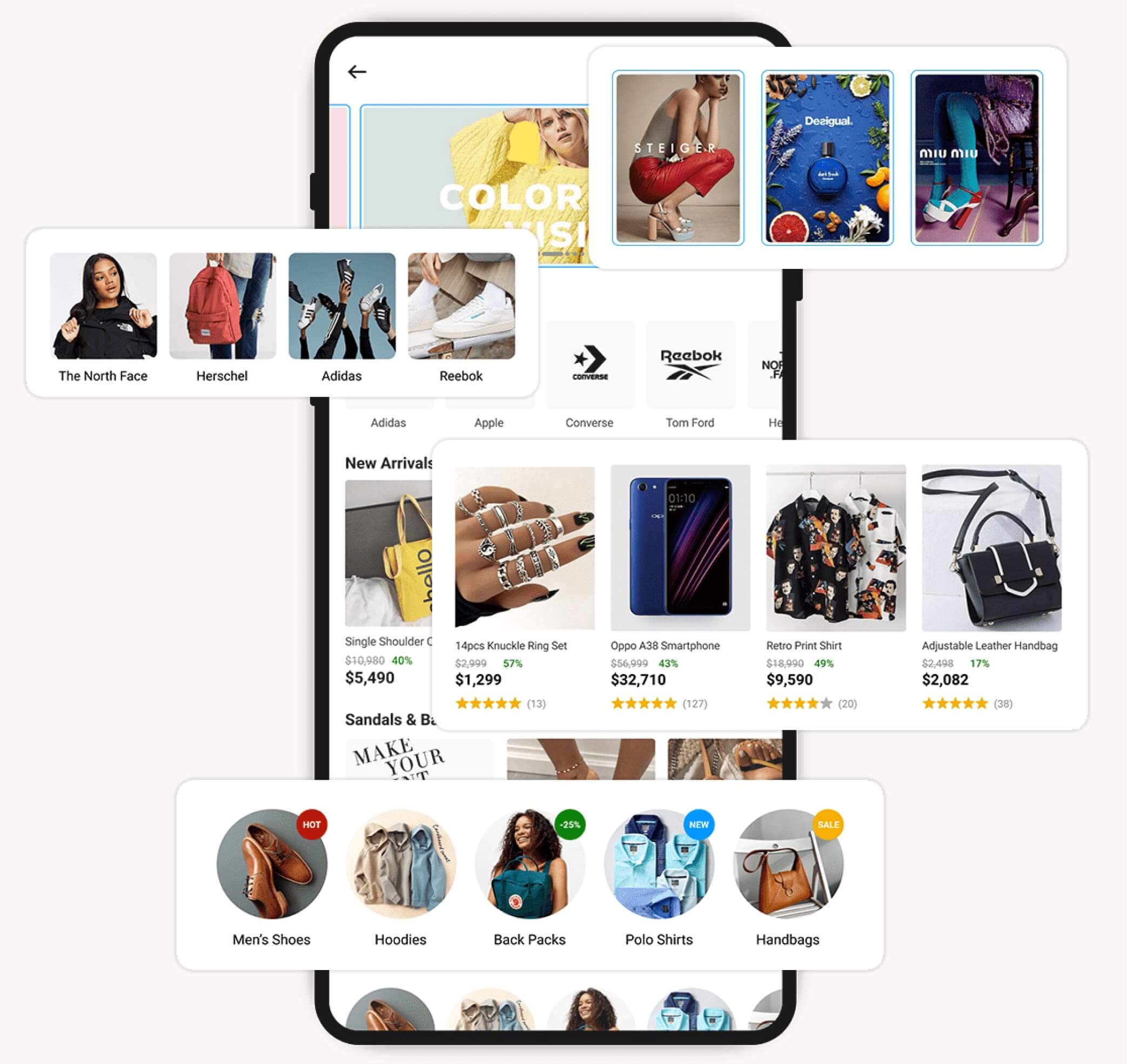
To address this issue, we designed featured brand thumbnail images using relatable visuals with a more lifestyle-oriented approach. Rather than just displaying the brand logo or icon, we used images that resonated with our customers and represented the brand’s service offering. This approach allowed customers, even those unfamiliar with the brand logo, to associate their shopping needs with the lifestyle images provided.
- Control – Thumbnail image with brand logo
- Variation – Thumbnail image with lifestyle images


Results
+16.9%
Click Through Rate
+8.2%
Conversion Rate
Takeaway & Recommendations
The use of lifestyle imagery resulted in higher click-through rates on the brand thumbnails compared to the generic images with the brand logos. For even better performance on this placement type, using lifestyle images that are the same as or aligned with the brand’s identity and/or current marketing campaigns was a more performance driven approach.
A/B TEST IDEA
Product Card Redesign
Customers’ buying decisions are heavily influenced by feedback from other customers. By showcasing customer product feedback in the form of ratings on the product cards displayed on the category page, it is possible to improve the click-through rate and conversion performance of these featured products.
Ratings on the product card design would serve as a trust-building measure with customers. A test involving both variants of product card designs was conducted, with click-through rates and placement conversion rates at the category page level measured as the success metric.
- Control – Product card design with no rating information
- Variation – Product card design with ratings displayed


Results
+8.72%
Click Through Rate
+42.7%
Conversion Rate
Takeaway & Recommendations
Displaying the product ratings of each item effectively improved individual product performance and the overall performance of the category page. In the next test scenario for the product card redesign, we will consider displaying the “Add to Cart” button on all product cards on the category page.
Displaying product ratings eliminated the need for customers to visit the individual product pages to see the product ratings, particularly for customers who are confident about their choices from the category page.
A/B TEST IDEA
Sliders vs Story Panels
Opinions regarding the functionality, practicality, and performance of sliders on category pages are quite divided. While some teams embrace them, others show little interest. Although sliders make efficient use of website real estate to showcase offerings and offer user control, they also come with downsides that can lead to a poor user experience. One significant drawback is “banner blindness,” where users view sliders similarly to ads and tend to skip over them.
Performance data on the existing sliders revealed a consistent decline in their effectiveness over time. In addition, there was a notable difference in engagement among sliders, with up to a 75% and 82% reduction in impressions and click-through rates, respectively, between the first slider (n=1) and the last slider (n=7).
Given these findings, it became essential to question the true impact of sliders on performance. Is their importance overrated? What if we replace them with other placement options—could this lead to performance improvements?
To address these questions, we opted to replace the sliders on the category page with a thumbnail image carousel. This decision was based on the positive results from the other AB test on Brand Thumbnail performance.
- Control – Slider with campaign, category and brand offerings mix
- Variation – Thumbnail carousel with campaign, category and brand offerings mix


Results
+6.40%
ClickThrough Rate
+8.72%
Revenue per Impression
+5.25%
Conversion Rate
Takeaway & Recommendations
Switching the sliders with thumbnail images improved the performance of each featured campaign. User’s had access to more campaign/category thumbnails displayed to them in a single view, and in an easier to view style.
A/B TEST IDEA
“Flare-ing”
With the increased performance of the category page as a result of the thumbnail carousel, new questions arose about how to further improve their performance. This is especially important given their smaller design compared to sliders and the limited information they can contain.
A feasible solution was the addition of “flares” to some of the featured thumbnails. These “flares” would serve as markers to attract the customers’ attention and encourage them to click. We opted to replace the sliders on the category page with a thumbnail image carousel
- Control – Services (Mall, Global, Pay, Food…)
- Variation – Categories (Smartphones, Groceries, Beauty, Computing…)


Results
+10.43%
Click Through Rate
+22.94%
Revenue Per Impression
Takeaway & Recommendations
“Flare-ing” enhanced customer engagement with the thumbnails, improving both individual placement performance and widget grouping. Extending the use of “flares” beyond just displaying discounts helped diversify the content offerings and further boosted engagement.
However, it’s essential to be cautious and avoid over “flare-ing,” as this could result in a cluttered design and potentially degrade the user experience.
Revamped Page Design
Taking into considerations learnings from the AB tests and recommendations, a final design of the category pages was settled on.


What’s Next?
The redesigned template for the category pages was customized to suit each category and rolled out across the website. The category page redesigns were executed according to a predefined schedule, and design enhancements incorporated into the growing list of AB testing and experimentation concepts for validation.
A positive outcome of this exercise is the increased interest in data-driven decision-making among the teams, leading to notable performance improvements.
Learnings
Tests break and sometimes don’t go as planned.
Due to the large number of people working on the website and making content changes or updates, there’s an increased risk of tests breaking. This occurred a couple of times, particularly when changes were made to the control design during testing.
To address this issue, proactive communication of test goals and timelines, along with aligning tests with team schedules, helped mitigate the problem. In certain situations, changes were unavoidable, necessitating updates to both the control and variation scenarios.
Watch out for biased opinions
Despite the test results, some key stakeholders held out and had biased opinions about design decisions, The most vocal objection being replacing sliders with thumbnails, which posed a potential performance obstacle. Properly management of stakeholder opinions became crucial.
A compromise was reached by introducing banner placements across the pages, featuring similar content to what would have been on the removed sliders.
Not all hypotheses require testing
The performance improvements observed in the initial testing phase led to increased interest in the AB testing process, even from individuals who didn’t fully grasp how AB testing should work. This influx of interest resulted in weaker hypotheses being proposed for testing, which diverted resource from more impactful testing.
Educating teams on effective hypotheses and test refinement helped to make them more impact driven. Some test ideas were cancelled as the outcomes would be too biased to be considered objective.
Patience, patience and more patience
It became essential to have a well-documented AB testing plan with clearly defined parameters and timelines. This plan should be shared with the teams and made accessible to all relevant stakeholders.
Patience is an important virtue when it comes to AB testing. There’s often a temptation to rush tests and prematurely declare a winning variation – prompted by the initial good performance of a variation or external pressure from stakeholders to conclude tests quickly and make way for more.
![]()
