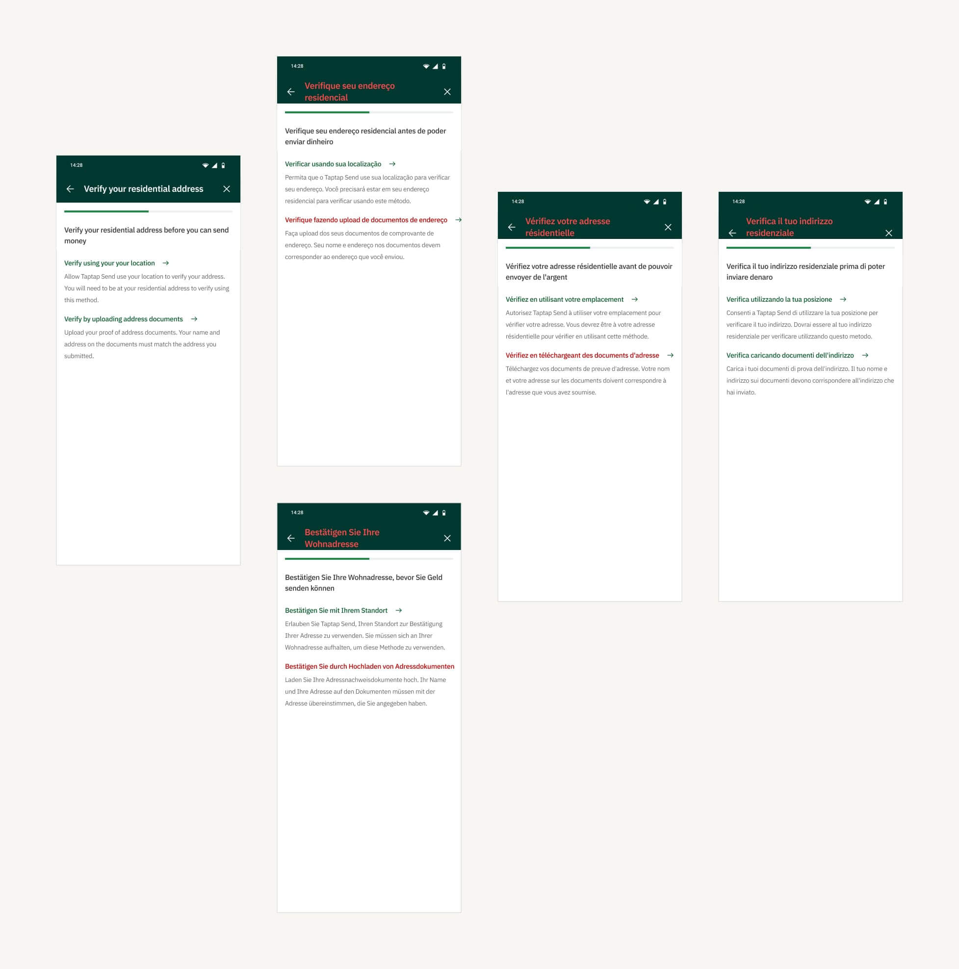
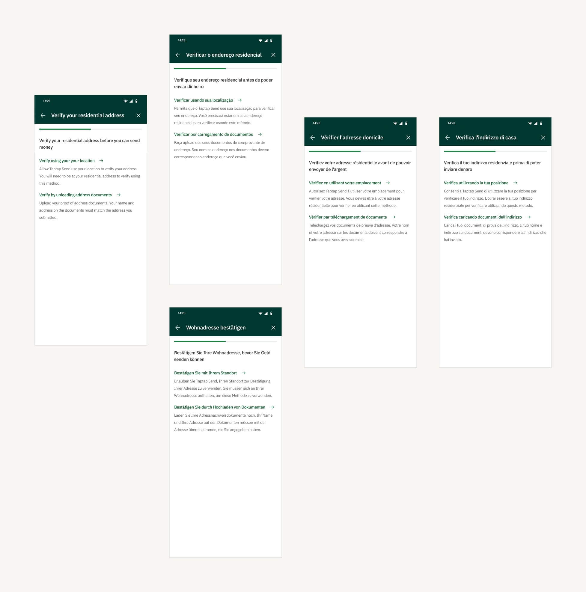
Taptap Send (TTS), a money transfer app, was on a growth trajectory. Expansion into new markets highlighted a significant challenge: the app’s English-only interface posed barriers for users in non-English speaking countries. Navigating the app and completing transactions became a frustrating barrier for a segment of users. Many struggled with the language, leading to high drop-off rates and reliance on third parties for transactions, risking security.
Driving Inclusive Growth through Fintech App Localization
With these challenges in mind, we started on translating the Taptap Send app into multiple languages, making it more inclusive and accessible for non-English speaking users, ultimately fueling user base growth.


Role
Product Design, UX/UI Design
Tools
Figma, ChatGPT, Gemini, Mixpanel
Industry
Fintech
Role
Product Design, UX/UI Design
Tools
Figma, ChatGPT, Gemini, Mixpanel
Industry
Fintech
The Problem
Language as a Barrier to Growth
Analysis of user data revealed high drop-off rates on screens that had additional or complex instructions along the user’s transaction journey. There was a significant numbers of new installs followed by uninstalls in non-English regions, with frequent support tickets related to navigation issues.

Understanding User Needs
We adopted a multi-pronged user research to tackle this language challenge. Data analysis played a crucial role in uncovering usage patterns and pain points. High drop-off rates on specific screens indicated user confusion, while the support tickets provided specific examples of language related navigation and transaction issues.
But data only tells part of the story. User interviews played a major role in allowing us to better understand user needs and challenges. These user conversations were crucial in understanding the cultural nuances that shaped their interactions with the app. This rich mix of data and user feedback became the focal point of our localization strategy.
Localization as a Growth Engine
Localization on the app was no longer just about translation, it became a powerful growth strategy. Removing the language barrier would unlock a vast new user base in non-English speaking markets. Understanding our user’s needs and challenges through data and interviews ensured a user-centric approach, paving the way for a successful localization project.
Designing for a Global Audience
Localization went beyond just simple translations to include detailed design considerations tailored to each language’s unique characteristics. We translated the app interface and content into French, Portuguese, Italian, Spanish, Vietnamese, Dutch, and Arabic (an RTL language).
Initial translations were done with ChatGPT and Bard. These were then refined and updated for local context in collaboration with the customer service teams.
RTL Design & Compatibility
Arabic, a right-to-left (RTL) language is written from the right side of the page to the left. The implication of this being that in addition to the translation, the app design needed to be mirrored to provide a natural reading flow. This included flipping the alignment of text and icons, ensuring a seamless user experience within the RTL framework.

Typography & Fonts
Compatibility with accented characters was important. Font used on the app was updated to ensure characters were displayed accurately while maintaining proper sizing and line heights for optimal readability across different languages. Accessibility considerations were a top priority.
Designing for Accented Characters
Design adjustments were made to optimize character spacing, kerning, and line-heights across the different language screens, ensuring accented characters displayed accurately across screens without layout distortions.
Visual clarity was a key focus throughout the design process to ensure accessibility in diverse linguistic contexts.
Collaborative Design Approach
Throughout the project, close collaboration with Product Managers, Engineering teams, Marketing specialists, and Customer Service representatives ensured alignment with both user needs and business objectives.
Working hand-in-hand with engineers was particularly vital for seamlessly integrating localized content into the existing app architecture. Implementing an auto language detection feature automatically adjusted the app interface to the user’s phone language setting to enhance user experience.

Design Challenges and Considerations
Localizing the app ended up being a more complex task that than just translating text. A major part of design considerations was figuring out which icons needed to be flipped for right-to-left languages like Arabic. Certain icons, like arrows, needed to be reversed, while others, like search icons, could remain unchanged.
Another hurdle was accommodating longer translated words, which often disrupted the layout. We had to carefully choose shorter alternatives while preserving the original meaning. Deciding on whether to translate email addresses and numbers, including phone numbers, in Arabic or keep as is in English was a major decision. We ultimately opted for a solution that ensured consistency and user experience.
Translating brand names on payment cards presented a unique challenge. We needed to respect the brand identity of these payment partners, while also making it easier for our customers to identify the cards. We made sure to use equivalent brand designs in the target language to ensure we did not distort the brand identity while still maintaining brand recognition.


Impact
A User-Centric Success Story
The impact of localization was clearly evident in user acquisition and engagement metrics from non-English speaking regions. Improved user comprehension on critical screens minimized user frustration and abandonment during transactions. New users downloading the app increased and drop-off rates on critical screens was reduced.
Learnings
Localization for Inclusive Growth
The localization initiative for the app showcased the importance of prioritizing user-centric design. By understanding the needs and addressing the unique challenges faced by users in non-English speaking regions, we successfully expanded the user base and fostered inclusive growth. Cross-functional collaboration was crucial, as it ensured that the solutions we developed were both technically feasible and aligned with user expectations.
Additionally, embracing a growth mindset and continuously iterating based on user feedback and data analytics proved vital in achieving sustained improvements in user experience and business outcomes.
Localization, when done thoughtfully, can be a powerful tool for reaching new audiences and achieving business goals. A key takeaway for me was the importance of user research and data analysis in driving growth through design.


