User Flow Analysis

With approximately over 1.5 million users visiting the website per day, having insights into how these customers flow across the offerings and over 10 million products is crucial to improving overall user experience and business performance.

Having an overview of how customers flow across the website pages during their shopping journey from site entry to exit gives insights into customer behaviour, preferences and needs – and how best to improve on their overall shopping experience.

User Flow Analysis

With approximately over 1.5 million users visiting the website per day, having insights into how these customers flow across the offerings and over 10 million products is crucial to improving overall user experience and business performance.

Having an overview of how customers flow across the website pages during their shopping journey from site entry to exit gives insights into customer behaviour, preferences and needs – and how best to improve on their overall shopping experience.

Role

Data Analysis, Prototype Design, UX

Tools

Microsoft Excel, PowerBI

Role

Data Analysis, Prototype Design, UX

Tools

Microsoft Excel, PowerBI

The Need

Customer Flow Mapping

Using customer analytics data, its possible to define patterns in user browsing activities. This data shows which pages they visit along their shopping experience and in which order, highlights looping behaviours that might indicate issues customers face with navigation, and where unexpected drop-offs occur during the customer journey.

Segmentation and Audiences

With a wide range of products and services to choose from, customers have the luxury of choice and by extension exhibit different shopping patterns. Segmenting helps to narrow the customer journey analysis into groups based on common characteristics. Shared interests segments including pages visited, products viewed, past purchases etc help with a better understanding of their shopping experience and how best to improve it.

Insights/Research Findings

Patterns and user browsing behaviours is affected by factors including Pagetype, Content, Time-to-Conversion etc. By analysing the customer analytics data, it is possible to obtain insights into questions that would help improve on the user shopping experience.

  • What is the customer shopping process and how do customers approach buying decisions?
  • How do customers navigate and interact with campaigns, pages and products across the website?
  • At what point do customers drop off the website during their shopping experience?
  • Does the customer browsing platform (Web vs App) affect their shopping journey on the website?
  • What page types or elements on campaigns and categories influence customer shopping decisions?

KPIs Tracked

  • Sessions
  • Pageviews
  • Conversions
  • Click Through Rate
  • Drop-offs & Exits
Insights/Research Findings

Patterns and user browsing behaviours is affected by factors including Pagetype, Content, Time-to-Conversion etc. By analysing the customer analytics data, it is possible to obtain insights into questions that would help improve on the user shopping experience.

  • What is the customer shopping process and how do customers approach buying decisions?
  • How do customers navigate and interact with campaigns, pages and products across the website?
  • At what point do customers drop off the website during their shopping experience?
  • Does the customer browsing platform (Web vs App) affect their shopping journey on the website?
  • What page types or elements on campaigns and categories influence customer shopping decisions?
KPIs Tracked
  • Sessions
  • Pageviews
  • Conversions
  • Click Through Rate
  • Drop-offs & Exits
Visualisation Prototypes

Sankey Diagram

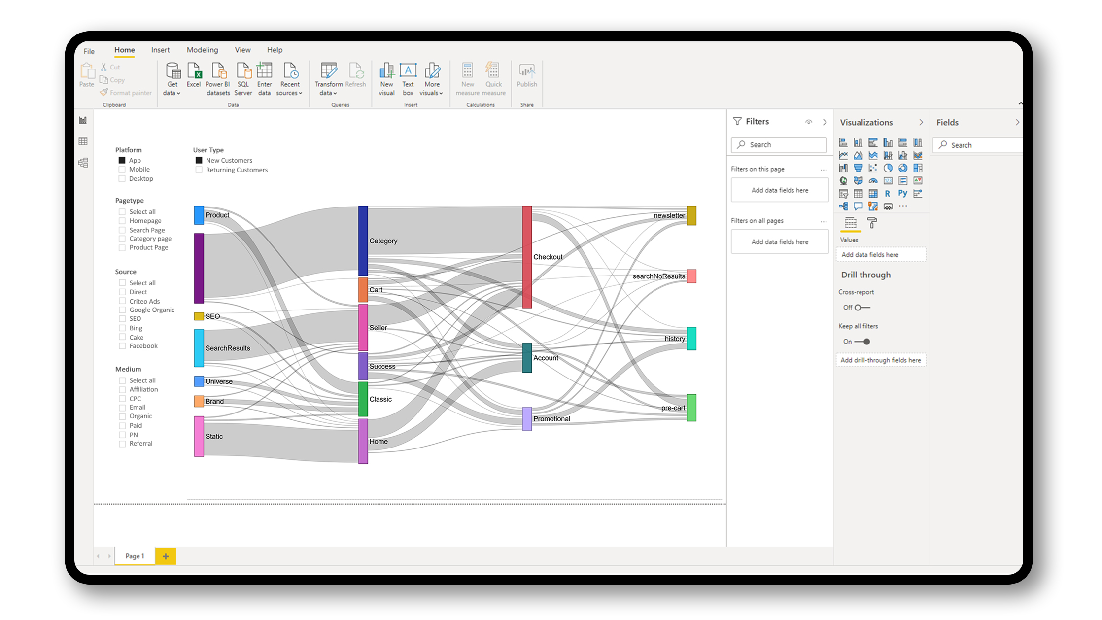
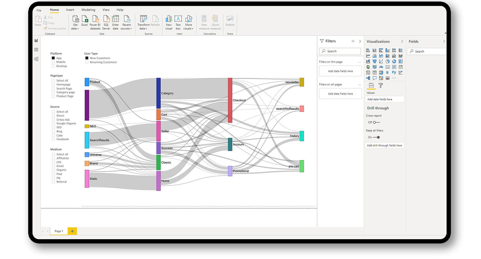
Sankey diagrams are useful for visualising the flow of any metric in proportion to the flow dimension quantity. Featuring different color coded bands, the color bands allow for intuitive understanding of the data presented. The link width represents the proportionality of the metric to the dimension quantity flow being visualized – if a flow is twice as wide, it represents double the quantity.

Limitations

  • Not easy to read and understand the data – especially for those new to visualisation.
  • Flows with similar widths are hard to differentiate or quantify.
  • Overlapping flows could cause clutter with larger volumes of data and nodes.

Tassels Parallel Sets Slider

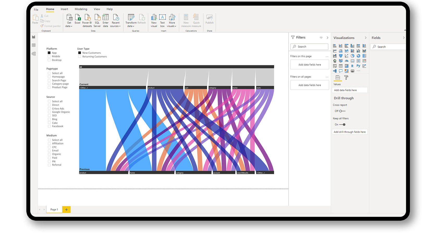
The Tassels Parallel Sets Slider is an interactive slicer useful for exploring multi-categorical data. It creates an interactive way to visualise and analyze data with additional functionality for filtering using toggles to create more granular views.

Limitations

  • Use limitation to data with maximum of two dimensions.
  • Larger datasets makes visualisation difficult to read and interpret.
Tassels Parallel Sets Slider

The Tassels Parallel Sets Slider is an interactive slicer useful for exploring multi-categorical data. It creates an interactive way to visualise and analyze data with additional functionality for filtering using toggles to create more granular views.

Limitations
  • Use limitation to data with maximum of two dimensions.
  • Larger datasets makes visualisation difficult to read and interpret.

Decomposition Tree

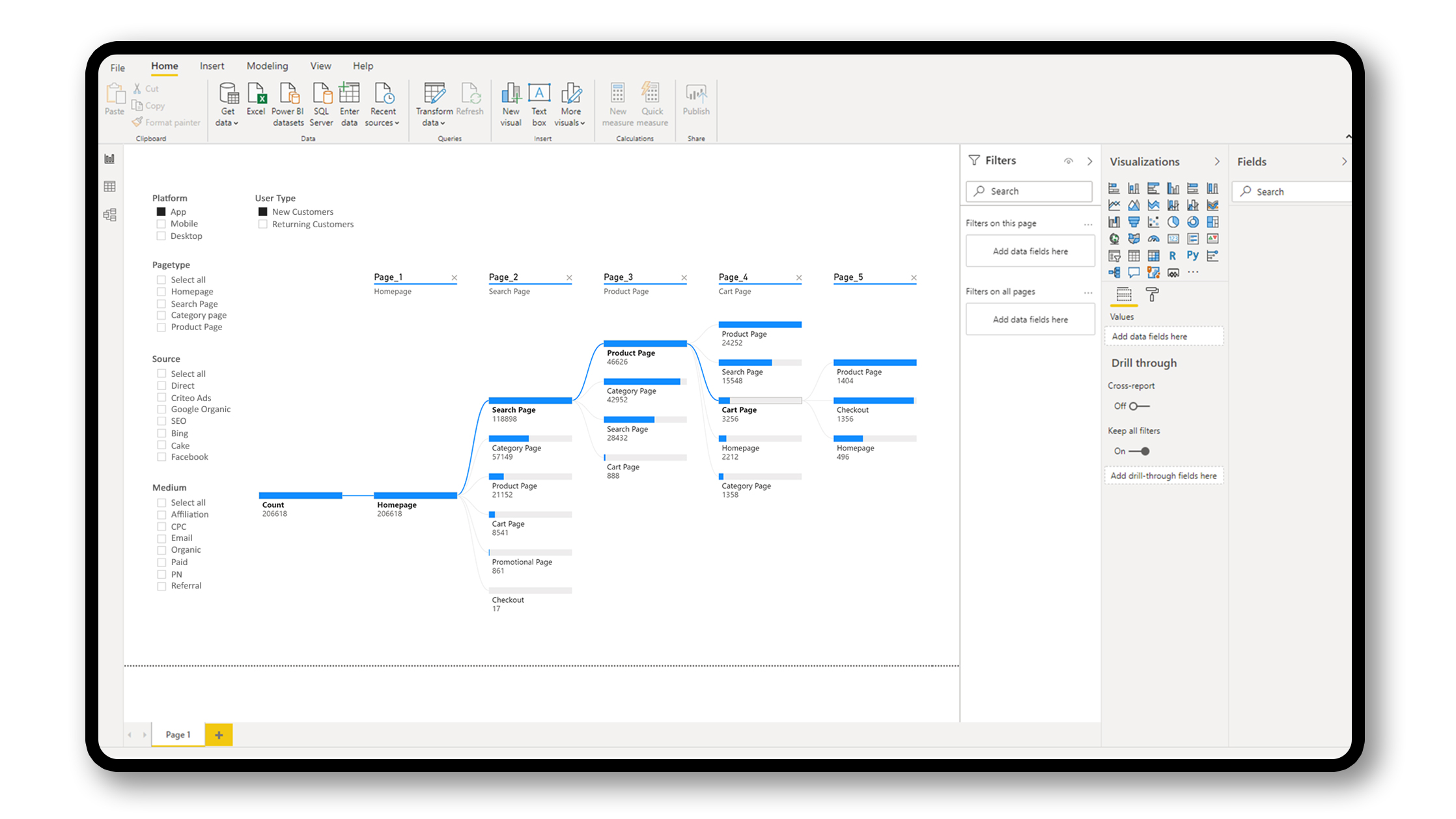
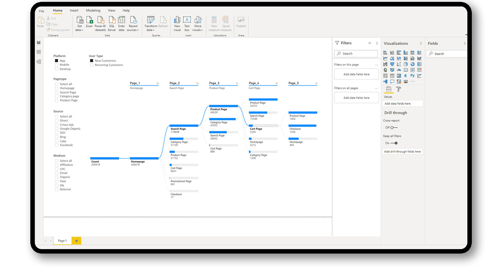
Decomposition tree allows data visualization across multiple dimensions. By automatically aggregating data, data can be drilled down and analyzed in the hierarchy for a quick analysis. The drill down nature makes it a valuable tool for ad hoc exploration and root cause analysis.

Limitations
  • Data drilldown is restricted to a maximum of 50 levels.
  • Only a maximum of 5,000 data points is possible at one time in the tree.
  • Display of entire tree view is not possible, but instead truncated.

Chord Diagram

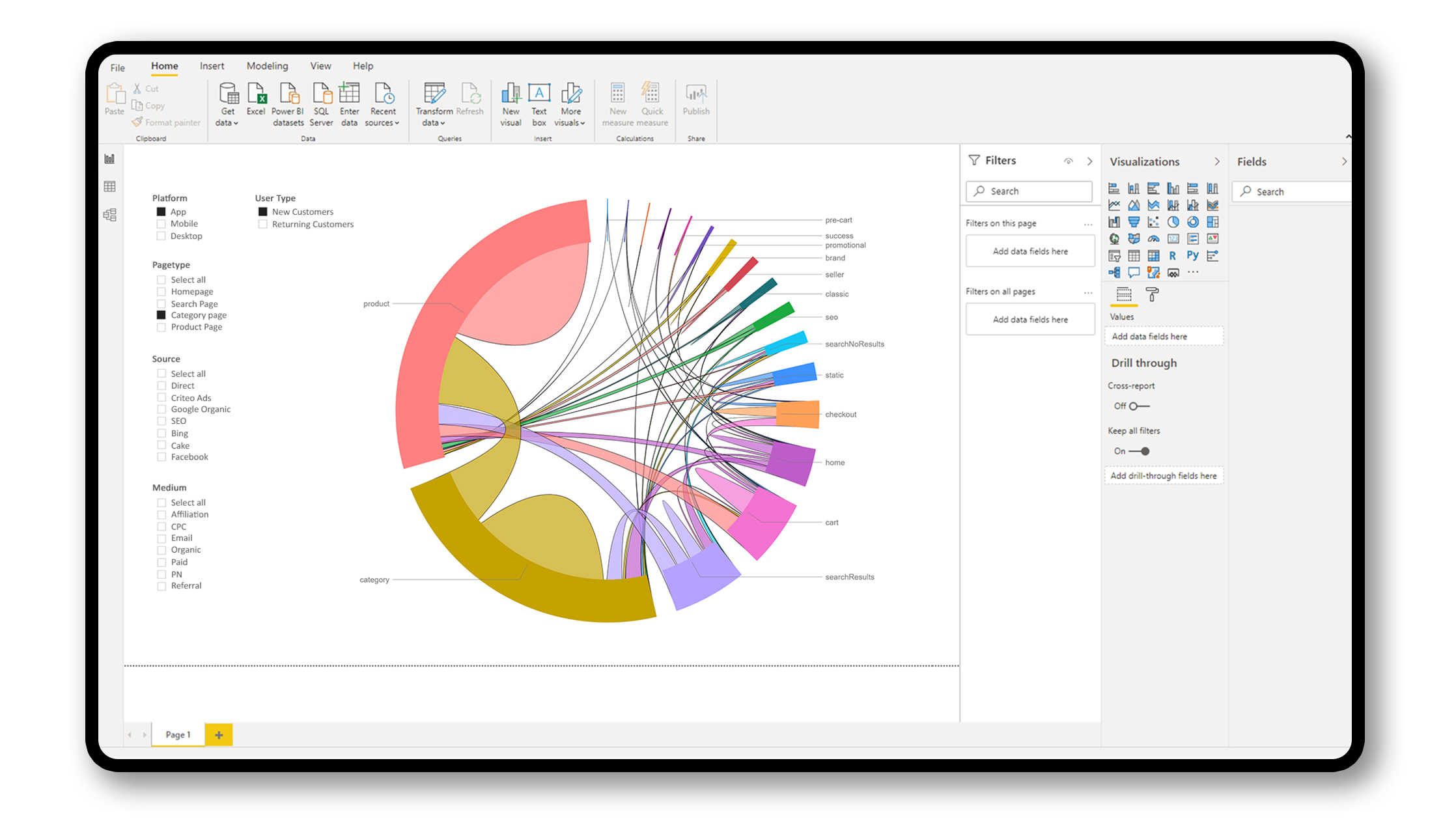
Chord Diagrams can provide a compact, economical way to represent flows and connections between entities/nodes in data. Chord diagrams appear complex to read, but are perfect for tracking similarities within different data groups or values within a single set of data. Data representation is based on position, area, and color hue.

Limitations

  • The more the links, the noisier it gets and the less useful.
  • Not feasible for in-depth exploration or advanced interactions.
  • Colors as a dimension representation makes it overwhelming at first look.
  • Data representation is limited to a single matrix and no cross linking.
Chord Diagram

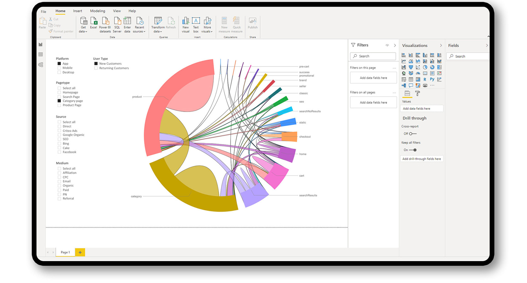
Chord Diagrams can provide a compact, economical way to represent flows and connections between entities/nodes in data. Chord diagrams appear complex to read, but are perfect for tracking similarities within different data groups or values within a single set of data. Data representation is based on position, area, and color hue.

Limitations
  • The more the links, the noisier it gets and the less useful.
  • Not feasible for in-depth exploration or advanced interactions.
  • Colors as a dimension representation makes it overwhelming at first look.
  • Data representation is limited to a single matrix and no cross linking.
Sunburst Visualisation Design

Sunburst charts are useful for vusialisation of hierarchical datasets using concentric rings with each ring corresponding to a level in the hierarchy. A Sunburst chart uses a radial layout to create the dataset visualisation experience. Focusing on a segment in the ring gives the sense of its relationship to the whole data set.

  • Efficient space utilisation compared to linear visualisations
  • Intuitive in nature due to similarity to pie charts in design
  • Elements on the same level are equally as important

Rings are sliced up and divided based on their hierarchical relationship to the parent slice with each slice proportional to a value. Colour hues highlight hierarchal groupings or specific categories.

Rings are sliced up and divided based on their hierarchical relationship to the parent slice with each slice proportional to a value. Colour hues highlight hierarchal groupings or specific categories.

Future Developments

Reverse Customer Flow

Including feature to know the pages customers visited prior to landing on a particular page allows for more insights into improving conversion and reducing abandonment.

Journeys starting from a set Page

Being able to trace back the customer journey is one thing, but having knowledge of where their journey started from would reveal hidden patterns and clusters of behaviour, as well as a better understanding of the impact incoming channels have on performance.